
HEHE
A Web3 product with game mechanics, meme culture, and DeFi scenarios: from the landing page and Guest Mode to game programs, rewards, dashboard, and design system.

About the project
HEHE is a digital product concept designed from scratch for a Web3 ecosystem: from hypotheses and positioning to UX architecture and a visual system.
The project included designing the full user funnel: landing page, Guest Mode entry, game mechanics, and key product scenarios.
A separate focus was building a cohesive design system for a complex set of mechanics: Lottery, Draw, Staking, and Farming.
Business problem
The product lacked a clear and cohesive user-facing layer that could explain HEHE’s value to a new audience and quickly involve users in its scenarios.
For users with different levels of experience, entering the product could feel potentially difficult: Web3 mechanics required a clear structure, lower cognitive load, and more transparent onboarding.
Without this, the landing page, first entry, and game scenarios risked feeling overloaded and fragmented.
Business goal
Design the HEHE product concept from scratch: define positioning, build the UX logic, and design the full interaction funnel from first touchpoint to a target action inside the product.
The key goal was to make entry into the product clear even for a new audience, increase interest in the game mechanics, and create a scalable design system for future growth.
The solution needed to unite the landing page, Guest Mode, and core mechanics into one clear, readable, and visually cohesive experience.

Action plan
To design HEHE as a clear and cohesive Web3 product, the work was divided into several stages: formulating hypotheses, defining positioning, designing the UX architecture, and assembling the full user funnel from the landing page to game mechanics.
Special attention was paid to entry points for a new audience: the landing page had to quickly explain the product value, Guest Mode had to lower the entry barrier, and core scenarios had to involve the user without overloading them with terminology and complex actions.
In parallel, I built a scalable design system covering key Lottery, Draw, Staking, and Farming scenarios so the product could evolve consistently without visual gaps.
Target audience research
The research focused on understanding how users with different levels of experience perceive Web3 products, what sparks interest, and what pushes them away on the first screens.
It became clear that for a new audience the main barriers are complex mechanics, opaque scenarios, and overloaded interfaces, while more experienced users are frustrated by the lack of a coherent structure and quick control over actions.
The key expectations were the same for both groups: a clear entry point, logical transitions, a quick first action, and a visually coherent experience without a sense of chaos.
This directly shaped the UX decisions: I built a sequential funnel from landing page to Guest Mode to game mechanics, simplified onboarding, and structured the product architecture so users could quickly understand what to do, why to do it, and what result they would get.
Interview questions
Current experience
Working with the interface
Pain points
Expectations
Job Stories for HEHE
Based on interviews, mini-tests, and user scenario analysis, I formulated Job Stories to capture real user tasks during the first entry into HEHE, identify barriers, and define the key UX principles of the product.
The focus was on lowering the barrier to Web3 scenarios, making the mechanic understandable without unnecessary explanations, and building a path from first interest to a target action inside the product.
User journey map
This table shows the user journey from the first contact with HEHE to retention inside the product.
It helps show how motivation, emotions, expectations, and barriers change at each stage, and where the interface should reduce distrust, increase interest, and support engagement.


Competitor analysis
For HEHE, I studied Web3 products with game mechanics and crypto interfaces.
It was important to understand where users lose interest and trust at the very beginning.
As a result, the foundation became a clear entry point, Guest Mode, and simple mechanic logic without overload.
Competitors


Insights from the analysis
Easy entry without unnecessary barriers
Users need a quick start without complex preparation. The fewer mandatory entry steps there are, the higher the chance that they will actually try the product.
Meme-driven fun as an entry point
Users are attracted by lightness, irony, and visual energy. But a meme alone is not enough: the fun has to be supported by a real usage scenario.
A quick result in the first minutes
The audience expects an instant response and a clear first action. If the value is not understood immediately, interest drops within the first minutes.
Transparency as the basis of trust
One of the main problems in the niche is a sense of deception and opacity. The interface must clearly explain what is happening, why it matters, and what the user will receive.
Simple mechanics instead of overloaded tokenomics
Complex schemes, terminology, and overloaded screens push users away. The basic logic should be understandable without reading long explanations.
Retention through progress, not just hype
Many similar products become boring after one or two days. To retain users, the product needs clear progress, repeatable actions, and a sense of development.
Solution hypotheses
The hypotheses were based on several principles: fast entry into the product, reducing fear around Web3, clear game mechanics, a quick first result, simple presentation of Lottery / Draw / Staking / Farming, meme style as an entry point, and transparency as the foundation of trust.
Hypothesis 1. Fast entry into the product
Hypothesis 2. Guest Mode lowers the barrier
Hypothesis 3. The first mechanic should be clear within seconds
Hypothesis 4. A quick result matters more than long onboarding
Hypothesis 5. Simple mechanics instead of complex tokenomics
Hypothesis 6. Meme-driven presentation should work as an entry point, not as noise
Hypothesis 7. Transparency increases trust
Scenario design
At this stage, I used the formulated Job Stories and built a user flow for key user scenarios: first entry, transition to Guest Mode, launch of game mechanics, receiving a result, wallet connection, and return to the product.
This made it possible to break actions into simple steps, see the interaction structure, and identify unnecessary actions and potential error points before detailed interface design.

Key game scenario breakdown
This table captures the main user interaction scenario with the product: from exploring the mechanic to receiving a reward.
Based on it, I defined critical barriers, product decisions, required screens, and interface elements that help bring the user to the first clear result.

First wireframes and product structure
At this stage, I built the early product structure and first wireframes for key screens.
This helped quickly test composition, transition logic, and the basic architecture of the user path before detailed visual design.

Landing page home screen
The landing page was designed as the first contact point with HEHE.
It needed to quickly explain the product, show the game mechanics, reduce distrust toward the Web3 scenario, and bring the user to the first action.

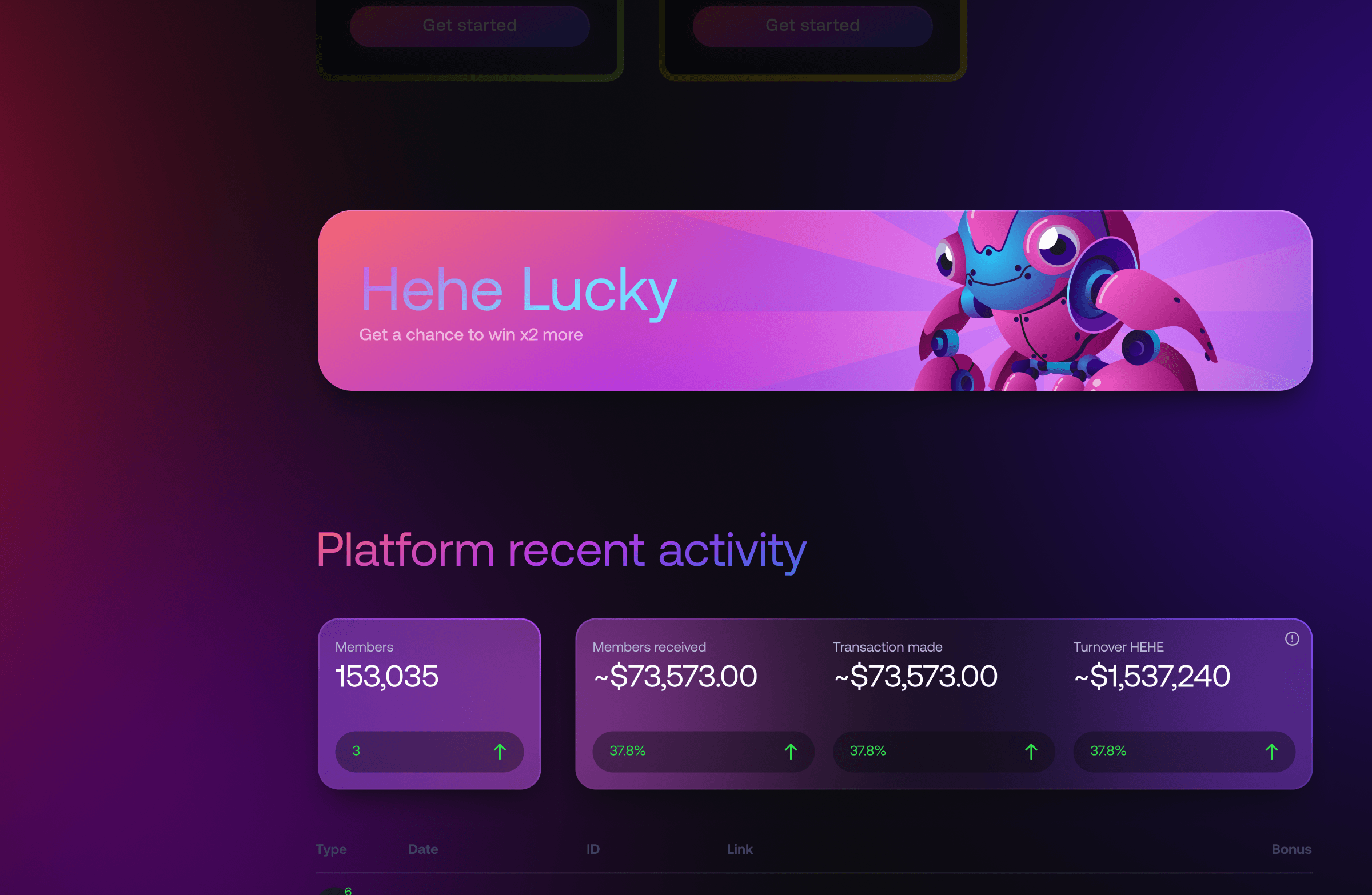
Hehe Lucky for quick entry into the game mechanic
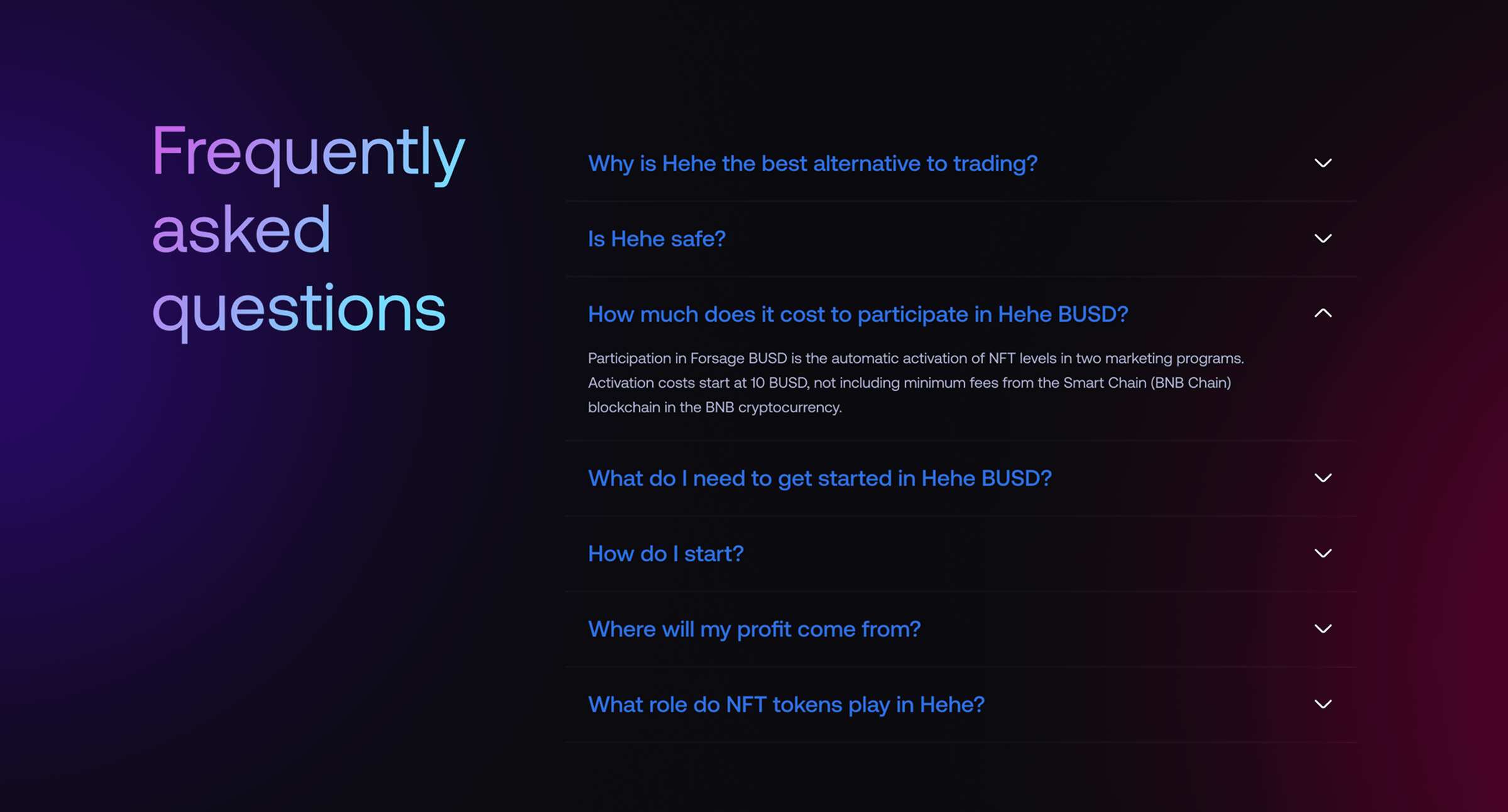
I designed this page so the user could quickly understand the rules, see the chance of winning, launch the mechanic immediately, and still receive enough information for trust: statistics, game history, and answers to key questions.


Dashboard
I designed this screen so the user could immediately see their status, income, referral metrics, and available programs, quickly move to the next action, and perceive the dashboard as a clear control point inside the product.


MonsterBallx3 program page
I designed this page so the user could immediately see their progress, participation conditions, potential reward, and next step, while the scenario itself worked not as a one-time mechanic but as a retention cycle through activation, goals, the referral system, and repeated return to the product.


Additional product pages
In addition to the main game scenarios, I designed additional product pages: Staking, Leaderboard, Partners, Stats, and Links.
These screens help users not only launch game mechanics, but also control progress, see results, work with the partner system, and return to the product through clear navigation points.
Staking and wallet connection
The staking page shows users the key parameters before they take action: APR, available amount, expected income, boost program, waiting time, fee, and reward conditions.
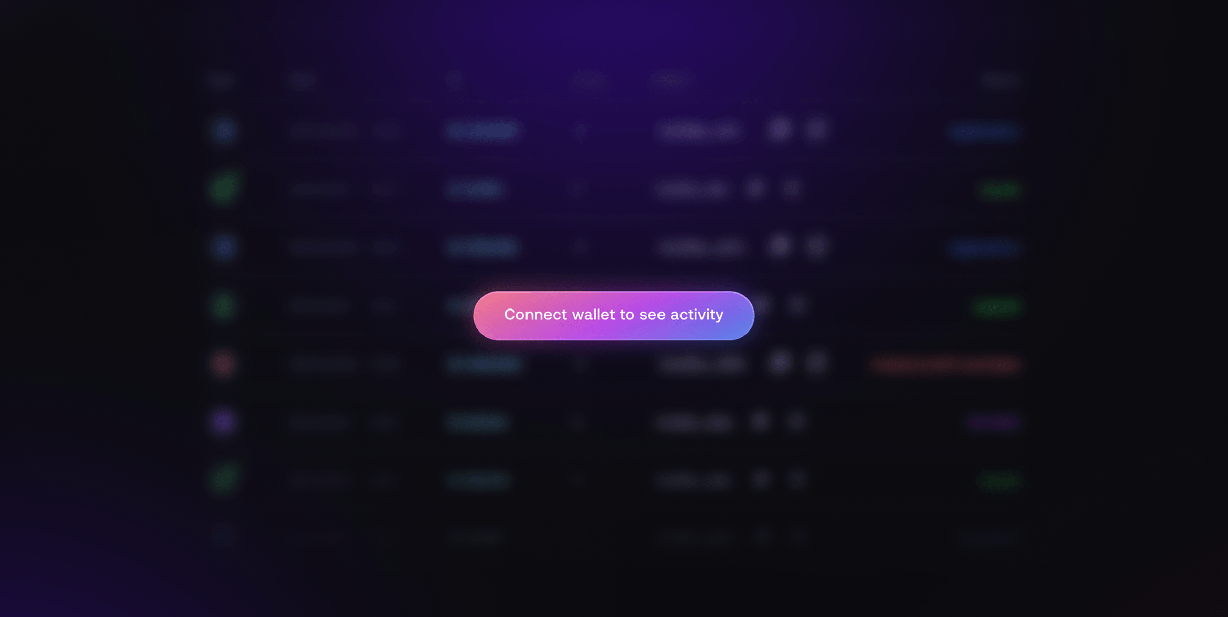
I designed the screen so wallet connection would not feel like a harsh barrier: first the user sees the mechanic, conditions, and answers to frequent questions, and only then decides whether to connect.


Leaderboard
The Leaderboard adds a competitive layer and helps users see their position compared to other participants.
I divided the ranking into clear periods — day, week, month, and all time — so users can quickly compare results, see volume and profit, and return to action inside the product.


Partners
The Partners page is needed for working with the partner system: the user sees the ID, list of partners, programs, levels, profit, and number of new participants.
I designed the screen as a working table with filters so users can quickly find the needed records and perceive the partner mechanic as a controlled process, not as a hidden part of the product.

Stats
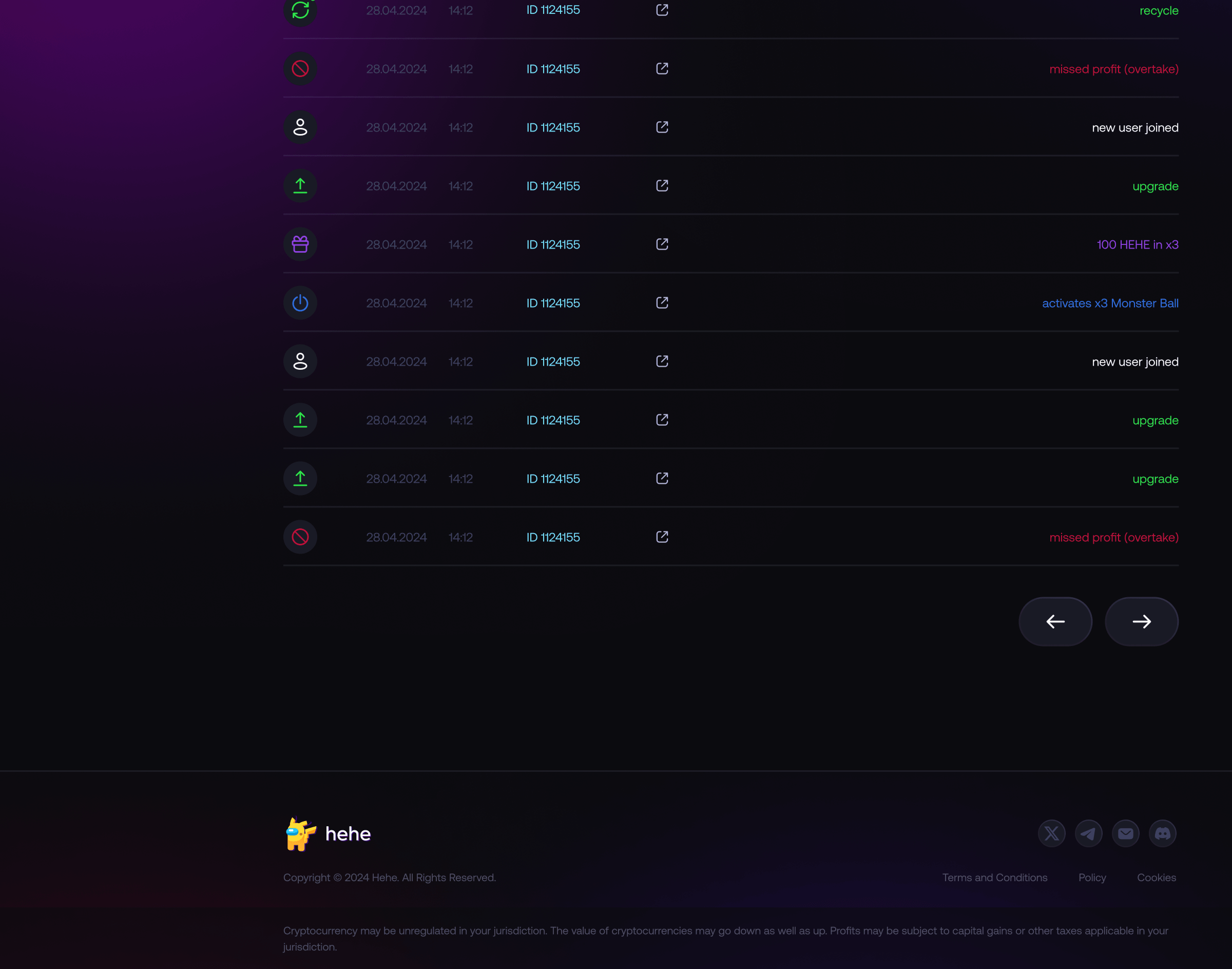
Stats records the history of events inside the product: registrations, upgrades, staking, missed profit, recycles, and accruals.
This screen helps users restore context, check actions, and understand what happened with their account and team over time.

Links
Links is a page for quick access to a personal partner link and basic acquisition metrics.
The user sees their personal link, can quickly copy it, and can also assess clicks, partners, profit, and the dynamics of new participants through a chart.

UI-kit
The UI kit was built as a unified system for fast and clear interaction with the Web3 product.
It is based on a high-contrast visual style, readability, emphasis on key actions, game states, rewards, program cards, buttons, and trust elements.
I documented the core interface components — colors, typography, buttons, cards, states, and icons — to ensure consistency and speed up product development.


Results
The exact project metrics are not disclosed, so the case study does not include quantitative indicators.
All decisions were treated as product hypotheses: for each scenario, I determined how it affects product entry, understanding of mechanics, trust, first action, and retention.
The main focus was reducing Web3 entry barriers, simplifying the explanation of game mechanics, increasing interface transparency, and shortening the path from first interest to the first action inside the product.
