
Aleela
A digital wellness game inspired by the ideas of Lila: it creates a space for self-observation in a short, clear mobile format.

About the project
Aleela is a mobile game created from scratch as an independent digital product inspired by the ideas of Lila.
The goal was not to directly transfer the classic mechanics, but to design a new game experience for smartphones: more compact, visually clear, and convenient for short user sessions.
Business problem
The market lacked a convenient mobile product that could preserve the atmosphere and depth of self-discovery practices while being designed specifically as a digital-first experience.
Directly transferring board-game or traditional mechanics to a phone screen led to an overloaded interface, complex onboarding, and poor readability of the game board.
Business task
Design an independent mobile-first game in the wellness / self-discovery genre from scratch, inspired by Lila but not copying it.
The key goal was to rethink the board structure, reduce visual overload, and create a convenient game experience where all key elements are readable and manageable within a smartphone screen.

Action plan
To design Aleela as an independent mobile-first product, I broke the task down into several stages: researching the original Lila mechanics, analyzing similar wellness and self-discovery products, identifying mobile-screen constraints, and searching for a new game-board structure.
The task was not to literally transfer the classic game into digital, but to create a new experience that preserves the atmosphere of self-discovery while feeling simpler, working faster, and not overloading the user on a smartphone screen.
The goal was to find a balance between depth, visual expressiveness, and ease of interaction: reduce the number of entities on the screen, rethink the board structure, simplify navigation, and make the scenario understandable even for users who had never encountered such practices before.
Target audience research
The research aimed to understand how users perceive self-discovery practices in a digital product and where the line lies between “interesting depth” and “complexity users do not want to dive into.” The focus was on motivation, usage scenarios, expectations for the visual style, perception comfort, and willingness to interact with symbolic game mechanics on a mobile device.
The results showed that three things are especially important for this audience: a gentle entry point, visual clarity, and a sense of controlled movement through the scenario. The user should feel that the product guides them step by step instead of forcing them to understand a complex system immediately. This directly influenced Aleela’s structure: the number of fields and objects was rethought so the game remained expressive while fitting the logic of a single mobile screen and preserving readability.
Interview questions
Current experience
Pain points
Working with the interface
Expectations
List of Job Stories
Based on interviews and gathered insights, I formulated Job Stories to capture real user tasks, identify key pain points, and define which solutions should form the basis of the design.
Analysis findings
Short game steps
Scenarios that do not require deep immersion work best. It is easier for users to engage with the product when the path is broken into short and clear actions. The less complexity they feel at the start, the higher the chance they will stay in the scenario.
Simplicity without feeling primitive
The interface should be light and clear, but not oversimplified. If the presentation feels too childish or superficial, part of the audience will not take the product seriously. It is important to maintain a balance between softness, aesthetics, and meaning.
A clear visual path
The audience needs not just to read text, but to see where they are moving. If the interface lacks a sense of path, progress, and the next step, engagement drops quickly. In Aleela, the structure should guide the user gently and consistently.
Illustrations as part of the mechanics
The visual language here works not only for aesthetics, but also for understanding the state, stage, and context. Illustrations and the game board help users read meaning faster, but if overloaded with details, they start to get in the way. Therefore, visual expressiveness should remain controlled.
Engagement through image and atmosphere
Many wellness products have useful content but weak emotional delivery. Aleela can stand out through a warmer, more lively and game-like experience where the character, atmosphere, and sense of guidance matter, not just a set of screens and texts.
An alternative to reading
Not everyone is comfortable perceiving meaning through text. Audio and other supporting formats can make the experience more accessible and softer, especially in a relaxed or reflective scenario. But these elements should strengthen the product, not create extra noise.
Competitor analysis
For Aleela, I studied wellness and self-discovery products, as well as digital services with a similar logic of immersion into a scenario. It was important to understand how such products explain the mechanics, hold attention, and avoid overloading the user on a mobile screen.
The analysis showed that a simple structure, calm visual presentation, and a clear path within the scenario are especially important for this audience. These principles became the foundation of Aleela’s interface.
Competitors


First wireframes and product structure
At this stage, I assembled the early product structure and first wireframes for key screens. This made it possible to quickly test composition, transition logic, and the basic user-path architecture before detailed visual design.
The main task was not visual polish, but testing the scenario: how the user enters the product, moves through the steps, and how consistently they perceive the mechanics.

Solution hypotheses
The hypotheses were based on several principles: a short entry into the scenario, adaptation of the game board to the mobile screen, step-by-step user guidance, the character as a contact point, illustrations as part of the mechanics, minimal heavy text, and audio as an additional supporting layer.
The key idea is that the user should quickly understand what is happening, where they are moving, and what action to take next, without feeling overloaded or faced with complex instructions.
Hypothesis 1. Short entry into the scenario
Hypothesis 2. A board adapted for smartphones
Hypothesis 3. Step-by-step user guidance
Hypothesis 4. The character as a contact point
Hypothesis 5. Illustrations as part of the mechanics
Hypothesis 6. Minimal heavy text
Hypothesis 7. Audio as a supporting layer
All hypotheses were taken into work and implemented in the app
Scenario elaboration
At this stage, I relied on the formulated Job Stories and built a user flow for key user paths.
This helped break the main actions into steps, see the structure of each path, and identify potential error points and unnecessary actions before moving on to prioritization and detailed interface design.

Onboarding and game start
This section shows how the user first gets acquainted with Aleela, understands the game-board structure, and begins their journey. The scenario was made as gentle and clear as possible to lower the entry barrier and involve the user faster.

Request creation scenario
This section shows Aleela’s core game loop: turn, roll, movement across the board, and transition to a new cell. The scenario was designed to make the mechanics understandable from the first interaction, preserve the feeling of movement along a personal path, and avoid overloading the user with extra actions between turns.

Creating a request through chat
This scenario was created to help the user formulate a personal request without pressure or the paralysis of a blank screen. Through dialogue, clarifying questions, and ready-made examples, Aleela gently guides the person from a general topic to a clearer and more conscious formulation, making entry into the game simpler, clearer, and more human.

Archetypes and energies
This section was created to help the user better understand the inner states, qualities, and forces they interact with in the game. Through clear images — elements and types of energy — the app adds an additional layer of interpretation, makes the game path more meaningful, and helps connect what happens in the interface with the user’s personal feelings, emotions, and request.

Insight flow
The section was created as a living feed of observations, interpretations, and responses along the user’s game path. It helps save important thoughts, quickly return to selected cells, and see not separate fragments, but a holistic picture of one’s movement inside Aleela.

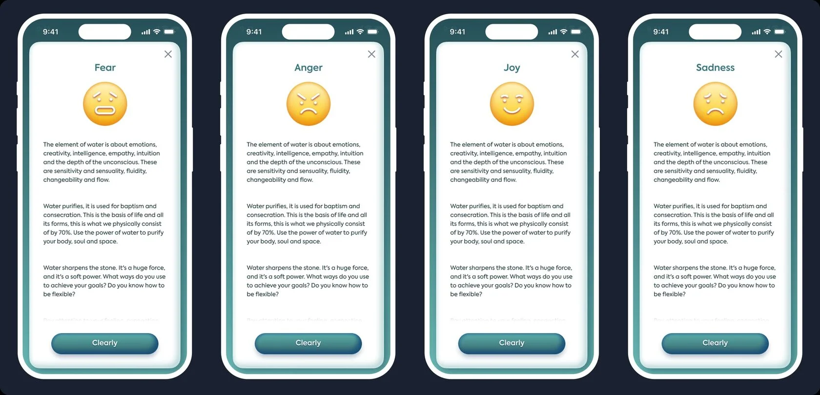
Emotions and states
The section was created to help the user better recognize their emotions and understand which inner state accompanies them in the game. Through simple visual images and short descriptions, Aleela provides an additional support point for self-observation and makes the journey more meaningful.
Profile and progress
This section was created so the user could see their path in Aleela not just as a set of separate moves, but as personal progress. It brings together key data about the user’s state, game dynamics, selected request, and accumulated statistics — helping them better understand their route, return to important points, and feel development within the scenario.

UI-kit
Aleela was created from scratch, so the UI kit was designed as an independent system for a mobile-first product. In this section, I show the key interface elements — colors, typography, buttons, forms, icons, navigation, and game components — that helped make the product cohesive, recognizable, and convenient for users.

Cell illustrations
For Aleela, 40 separate illustrations were created — one for each cell of the game board. They helped not only make the journey visually rich, but also give each point its own character, mood, and semantic accent. In the case study, I show only part of the illustrations to avoid overloading the page, but this is enough to convey the scope of work and show how the visual language supported the game mechanics.

Interviews and UX tests
Interviews and UX tests showed that Aleela’s main barrier is not the product idea itself, but the risk of overloading the user with complex moves and overly abstract presentation.

Results
The exact project metrics remain confidential, so I do not provide internal numbers in the case study.
However, all solutions were designed as testable product hypotheses: for each change, we defined which part of the user journey it affected and which metrics could be used to evaluate it after launch.
The focus was on reducing unnecessary actions, increasing interface clarity, and improving the main user path from entering the game to completing the scenario.
